The people who use our boards.
402 interviews since 2018
Erich
Hegenberger
Technical Translator, Digital Nomad, <br/>and Engineering Visionary
Who are you, and what do you do? What do you like to do outside of work?
I am Erich Hegenberger.
Back in the late '80s, I baffled my fellow ChemE students by announcing that I was quitting grad school to be a technical translator and have my own office on a sailboat. “But you’ll have to stay at the same dock all the time so you can string up a phone line,” they said, “and anyway, you won’t have a working hard drive as soon as the first duck swims by.” But the technology was already almost there even back then. So after a brief stint in industry as an in-house translator, terminologist, and technical trainer, I took what passed in those days for a laptop and a cell phone boasting 9600 bps and said goodbye to corporate life.
I got my first translation jobs from customers on a DOS-based bulletin board I set up for them, and later by email once industry finally caught up with what academia had long since left behind. I skied the Swiss Alps, toured the Galapagos and, with a 7” Toshiba Libretto 100CT and a satellite phone in my backpack, even hiked the Inca Trail while keeping up with work. Nowadays we take Wi-Fi for granted and complain when it’s not free, but had I realized it at the time, I suppose I could have written one of the first ever digital nomad guides and retired on the spot, while today it wouldn’t even rate a blip in the infosphere.
I did finally move my office aboard a sailboat, and after many zany adventures that would have done Farley Mowat proud, I eventually set foot ashore again in Viking country. Captivated, you could say, by the beauty of the area. So now I have a family and a home office with a plush executive recliner, with the very recent addition of a desk. Though mostly land-bound these days, I still have a Viking rowboat they let me out in every once in a while, and I can still regale the unsuspecting with tales of adventures at sea in the days of sail. And yes, I still have my bandwidth woes even ashore, the latest having been trying to find the right mound of moose poop in the back woods of Norway to balance atop long enough to download all the attachments to an email, only to be told later it was probably bear poop. Technology wipes its feet and marches on.
What hardware do you use?
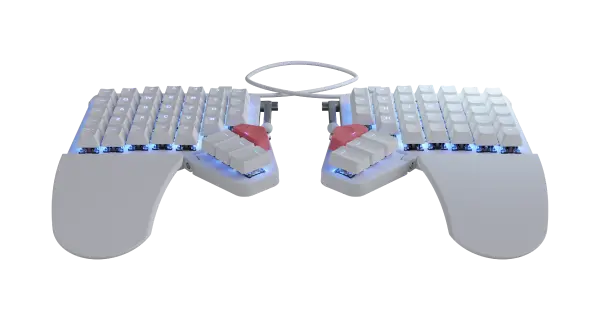
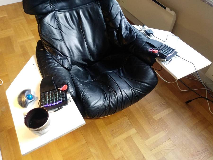
I use a Sager gaming laptop connected to two vintage 24” monitors when I’m in the office. A brand new Moonlander, a wireless trackball, and a microphone with a professional sound card complete the setup. Since I sit in my recliner, well, reclined, and I was used to having my standard wireless keyboard in my lap, placing the Moonlander up on the desk was never going to be an option.
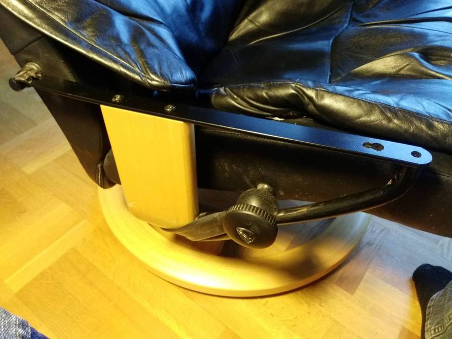
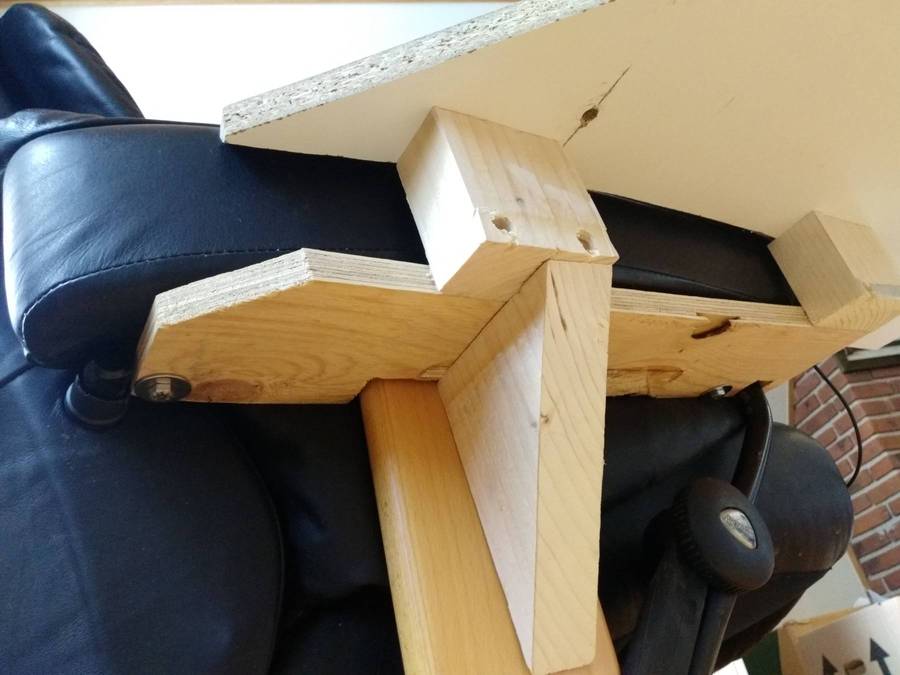
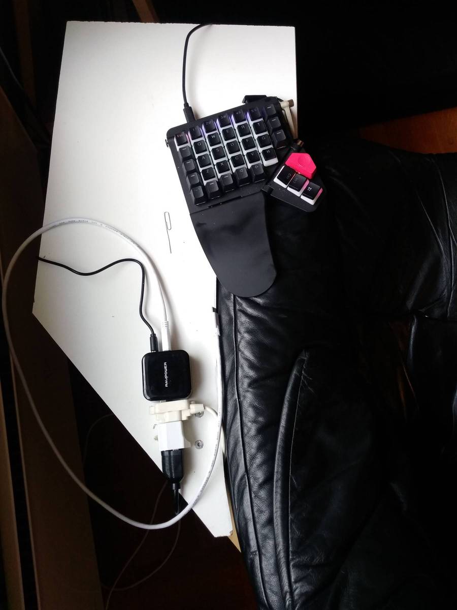
After looking at various high-tech options with monitor brackets, double ball-jointed camera mounts, and so forth, I decided low-tech was best and instead went for the Adirondack chair vibe. This proved especially easy since the armrests on my chair are bolted onto two solid metal rails, providing ample mounting points for any add-ons. The turret for my microphone, coffee cup, and cookies had to go, but the old shelving material I found was big enough to more than make up the difference in armrest real estate. The first iteration was bolted straight onto the mounting rails, but that proved about three inches too low.
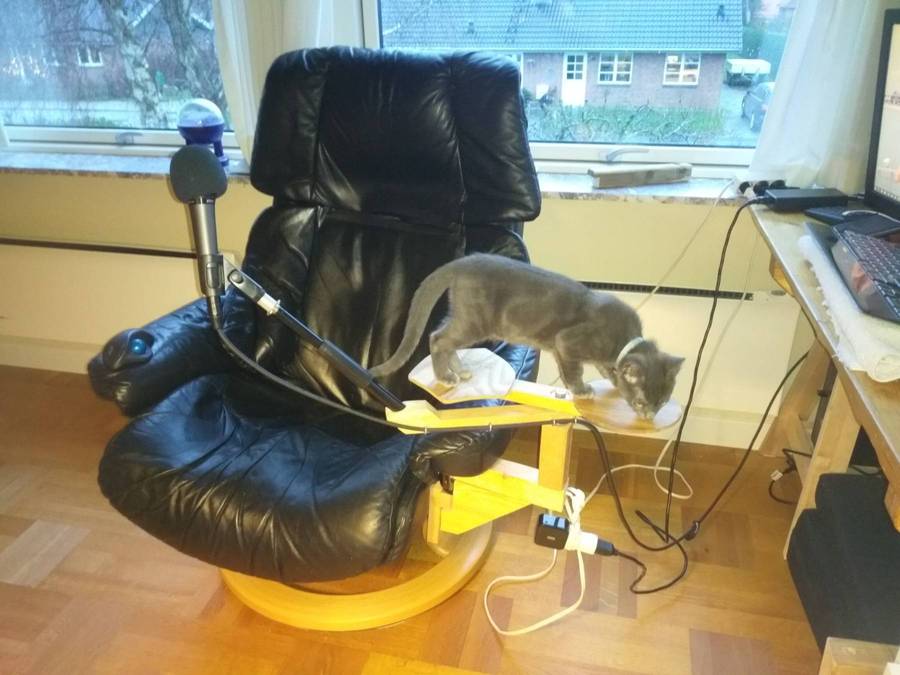
Fortunately, the box the Moonlander came in and a similar box I found were just the right thickness to support the units at proper typing height while I figured out the final design. This took a bit more effort, as I had to first carefully trace and cut out the shape of the armrests, make brackets to go out around them and then make sure everything was square and level.

These platforms are now cantilevered out pretty far, and they have to provide a very solid support for the Moonlander, my trackball, coffee, etc. while also serving as a frequent cat landing/launch pad. So belowdecks everything is glued and screwed with ample knee braces for extra rigidity. The entire chair rocks slightly when Mittens takes off on full afterburners, but that can’t be helped without outriggers.
Placing the units this far apart required my only additional purchase, an extra-long connecting cable under the chair. Unfortunately, our new kittens thought they saw it move, so after an awkward day with the stock cable trailing across my lap, I got a new aramid-reinforced one and hid it under the chair cushion for good measure. I have since coated all visible cables in the office with dish soap as a further deterr(g)ent.
And what software?
Over a decade ago, I developed my own translation tool that lets the user work in context right in the document, with the results from machine translation, fuzzy matches, and terminology lists all displayed in a very simple popup, like autotype on steroids. For want of good marketing skills, sales were, ah, less than anticipated, even though mainstream tools are only just now starting to adopt some of my old concepts. My wife calls this failure serendipity, since she’s been able in her own startup to carefully skip all the mistakes I so cleverly demonstrated.
So nowadays I just work with whichever of the three or four mainstream industry interfaces a specific customer requests. These all promote themselves to enterprise customers with unrealistic promises of cost savings, while forcing the hapless translator to work in what amounts to a dual-column spreadsheet devoid of context. I’ve done my best to automate these and make them all behave in the same way, mostly with some fairly extensive AutoHotKey scripts tying them in to other applications. I’ve also heavily automated the administrative side, first in VBS and then in Python, most recently also using JupyterLab. I also occasionally use Dragon for voice input, but these days the microphone is mostly for voiceover work, which I do in VideoPad.
What’s your keyboard setup like? Do you use a custom layout or custom keycaps?
I’ve been using Dvorak since the days when Macs started saying ‘hello.’ I always found the standard keyboard constraining, so I got one of the first DataHand units, which I used for many years until it started showing signs of wear. So I had been casting about for a good new input device, and fortunately I came across the Moonlander around the same time Mittens started indoctrinating his new assistants in the finer points of #NoTreatsNoWork.
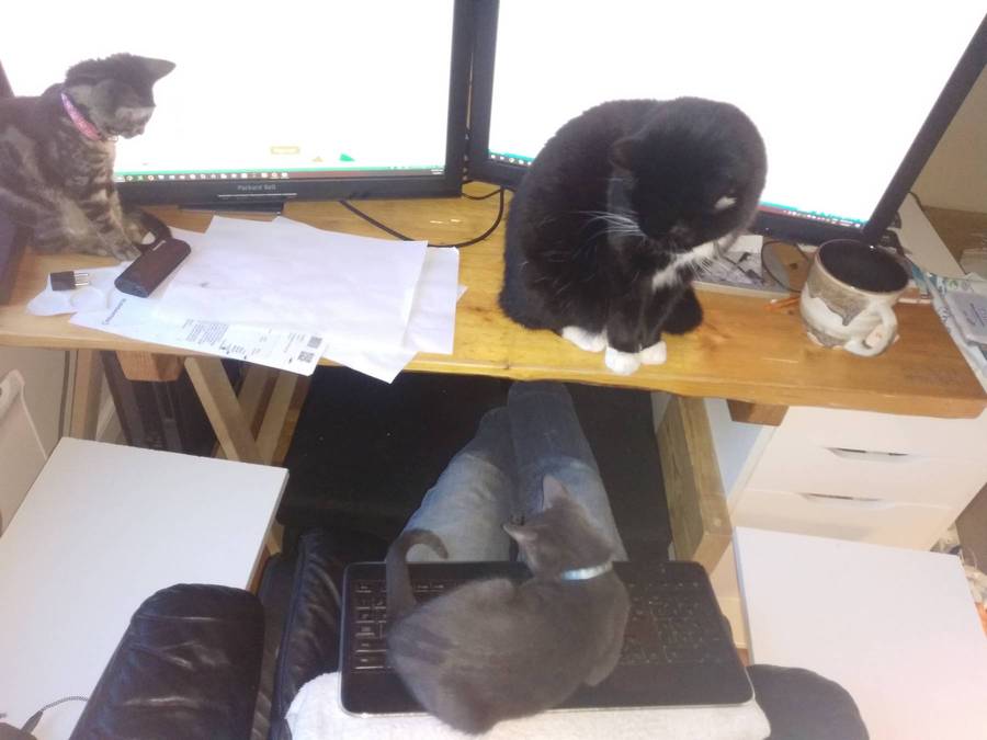
I don’t think I understood just how programmable the Moonlander was or what that would mean for my work, but it’s been an interesting learning experience. In retrospect, all the changes I’ve made have been incremental, and I’d strongly recommend that anyone deliberately apply this approach to their own layout. Starting out with what was nearly identical to the “standard” keyboard layout, with nothing but the spacebar on the thumb clusters, I had the chance to get used to the physical keyboard itself without having to be confronted with a new layout at the same time. After that, learning a new layout that I’d changed to suit my own needs turned out to be far easier than trying to learn some third-party layout. I know where the keys are not only because I put them there, but I also know why I put them there. The heat map is definitely also a big help in deciding whether to move specific keys and seeing where they could potentially go.
As of this writing, I’ve had my Moonlander for only three weeks, so my layout is still a work in progress, but the real breakthrough for me came with the understanding that, just like those pesky cats, keys can be either tapped or held to give different results. So far I’ve done this only for the spacebar, but that’s enough to put the next layer with the numpad navigation keys very literally at my fingertips with absolutely zero wasted motion. Since I switch between typing and navigation several times in every sentence, the time savings add up very quickly. I was admittedly hesitant to assign two functions to the spacebar, especially since I’m usually halfway through my next word before I ever let go of it, but once I discovered the settings and got the timing right, it’s as though the keyboard knows which function I want. Many thanks to Erez and his colleagues for helping out here and with other decisions. They have returned a good percentage of my purchase price in one-on-one support!
The next big improvement came with moving the spacing and command keys to the thumb clusters. Again, I had initially balked at this concept and instead tried to replicate the “standard” layout, but when I found myself having to stretch or take my fingers off the home keys, and then noticed my thumbs reaching for DataHand keys I had forgotten existed, it was clear what had to be done. This has been absolutely brilliant, since all I have to do is crook my right thumb slightly to access the Alt key with the function keys activated, and with very slight movements of my left thumb I can effortlessly glide between Ctrl, Shift, and Ctrl+Shift and back again.
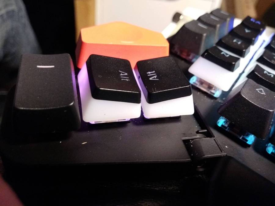
The final “upgrade” thus far has been the addition of sculpted keycaps to my Moonlander. Since I only look at keycap legends if I’m trying to help someone on their QWERTY layout, the actual set didn’t really matter, but I found a “pudding” set that allows the colors to show through the sides, which is a bit better for my particular viewing angle.
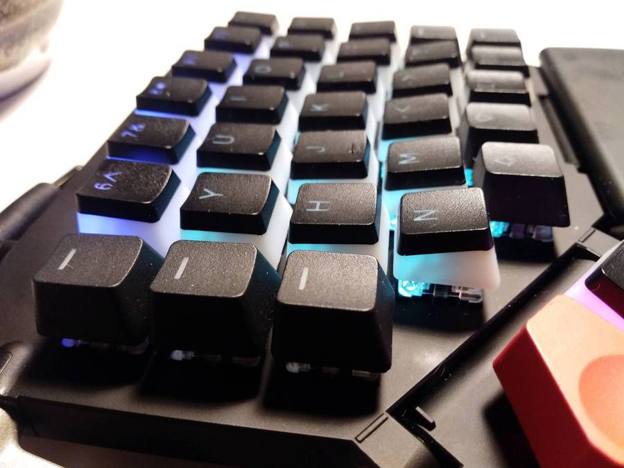
This made the home row much easier to find and stick to, while the rows above and below feel within more comfortable reach even though the physical distance is unchanged. As an added bonus, not only does putting sculpted keycaps on the thumb cluster again make the individual keys much more easily identifiable by touch and make the thumb combinations and slides feel that much more natural, they also form an open “channel” through which the red key can be reached without inadvertently pressing the other keys, so I could assign functions to them as well. With that, the only remote key left standing is Esc.
Also, there’s no Return/Enter key on my layer 0. Instead, I placed it in the middle of my numpad navigation keys on layer 1. Because I’m often navigating pop-up menus several times per sentence, I’m already on that layer, so I have the additional time savings of being able to instantly confirm menu selections by jabbing the center “numpad” button without having to reach for a distant Enter key with a weak finger. OK, if you put the Enter key on the same row as you’d expect to find it, it’s actually a whole key closer inboard than it would be on the standard ANSI layout, but I’m happy with this setup for now.
These changes have resulted in what appears at first glance to be a fairly sparse layout. The inner and outer columns and the bottom row on both left and right units are all but unused and unlit on layer 0. I may eventually do away with the top row as well, resulting in something closer to the Planck, albeit split. I should point out that since I’m using the Dvorak layout in Windows, the keys you see on my layout don’t correspond exactly with what comes out when I press them. However, I imagine you could take over this layout with few if any changes with QWERTY or your favorite ergonomic layout set in your OS.
What would be your dream setup?
I started looking for a decent wearable display decades ago. Surprise, still looking! Actually, TCL may finally be coming close to what I had in mind. But what I really want is a tactile interface, and by that I don’t mean a screen I can cover with my fingerprints. I want to be able to physically interact with the actual words in my document, complete with haptic feedback. Because I spend all day writing and editing documents, the process of selecting, cutting, copying and pasting text is an exercise in tedium that continually holds me back in my productive work, like having to unscrew four rusty bolts, including that last one that always sticks, every time all I want to do is reach out and pick up my coffee cup. Ctrl+arrows, Ctrl+Shift+more arrows, Ctrl+X, Ctrl+V... why can’t I just reach out and grab the word or group of words I want with my hand and put them where they belong without even thinking about it, then get back to what I was actually doing? Like Tom Cruise in The Minority Report, only without that I-can’t-believe-I’m-in-another-action-movie look of perpetual bewilderment on my face. Once again, industry and marketing are lagging far behind or even actively holding back technology that should have been readily available years ago. Oh, yes, that and routine space travel, which if anything is even longer overdue.

